Pages

Subscribe:

Wednesday, September 30, 2009

unique stairwells

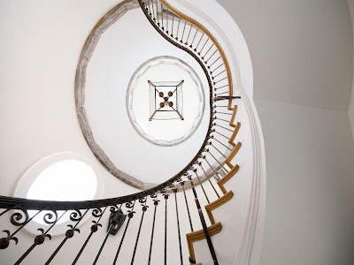
while i’ve been browsing photos i’ve come across some really unique stairwells.  whether it’s the railing, the shape or the color, something about these stairwells stood out to me. 

staircase

image – bhg

i love how this one spirals around and is free from the walls.

Bel Air Estate 1

image – michael s. smith

the red paint sets this stairway off.  it gives the the space so much character.

image – house beautiful

the railing is beautiful on this one.  cute pooches too!

image – martha stewart

railing looks vintage.  not sure if it is or not.

image – house beautiful

had to throw this one in since i’m in the smoky mountains this week.  reminds me of all the log cabins i’ve been seeing.

image – house beautiful

image – traditional home

image – traditional home

image – burnham design

image – willow decor

Tuesday, September 29, 2009

cute girl’s room

i think this is one of the cutest girl’s rooms i’ve ever seen.  it was designed by amanda nisbet of amanda nisbet design.  the bright colors she has used are so funky and fun, and i love the yellow accents throughout the room.  the hanging lantern light fixture and yellow side table bring the perfect touch of whimsy to the space. 

image

mixing and layering pillows is a great way to bring variety and depth to a room.  this daybed is a perfect example of that.

image

image

love the wall-to-wall striped carpet.  great color and texture. 

image

image

all images – amanda nisbet design

Monday, September 28, 2009

shoe storage

what a neat idea for shoe storage!  using fabric drapes in front of shelving is a great way to hide you’re storage items.  i really like how there is a personalized photo of each shoe on every shoe box.  i’d love to have the problem of trying to hide this many great shoes.

images – traditional home

away from home

this week while my dad’s out of town i’m up in tennessee house sitting, dog sitting and watching my grandmother for him.  i was a little worried when i got here because i didn’t think i was going to be able to connect to the internet.  he must have changed the network key to his router since he wrote it down the last time, but after a trip to staples to purchase a cat5 cable that i can hook directly to the router i’m back in business. 

dad’s house is in pigeon forge on a mountain top so i’ve got a great view while i’m here.  i wish the trees had started to turn though.  there’s nothing prettier than fall in the mountains of east tennessee. 

i brought along some great reading materials…the new house beautiful and the new traditional home magazines.  they will keep me busy in case i run out of blog to read.  i’ve got a few blogs that i have been meaning to do some back reading on and haven’t had time so this will be the perfect opportunity.

Traditional Home Cover

i’m bad about flipping through new magazines before i sit down to actually read the articles.  i did sneak a peak at the cover story of house beautiful “rooms you’ll never get tired of.”  they are right, i don’t think i would get tired of this family room in california designed by michael s. smith.  in the magazine this image covers almost 2 pages so you can really see the details well.  the chandelier is very charming with the turquoise glass beads around the center.  i also like the layered rugs.

i wouldn’t get tired of this kitchen either.  it’s from the same california home.

and how inviting is the guest room!

well off to catch up on my favorite blogs.  happy monday.
Burlap Love


I'm in LOVE with burlap lately. I added this faux roman shade to my kitchen valances and I think they look great. Just what they needed.

It was so simple. Here's how I did it with out threading a single needle!!!
First, I cut a piece of burlap with pinking sheers (Less fraying, but, if you like burlap, you'll like the fraying too!) And added a piece of double stick seam tape to the top end.
Folded the seam tape side over to create a pocket.
Slid in a tension rod and hung the rod under the valance. Ta-Da!!

Friday, September 25, 2009

loving…

1.  this federal hill row home home featured in chesapeake home.

see more pics here.

2.  beautiful art from painter amanda talley featured on the elements of style blog.

3.  this continuum buffet from stanley furniture.  i think it’s beautiful.

image

image

4.   this canvas art from z.gallerie.  i’ve been eyeing it for a while now.  i used to show horses when i was younger so i have a fondness for anything with horses on it.

Close this window

5.  this cool company called schoolhouse electric that has great schoolhouse reproduction lighting.  prices are reasonable too.

image

like this pendant fixture for only $109.00.

image

have a great weekend! hopefully the rain will stay away from atlanta like it has for the last couple of days.  we could do without it for a month considering the amount of rain we got all last week and the beginning of this week. 

Thursday, September 24, 2009

“first dance” wedding video

after we got married in may of 2008 billy created a slideshow out of our wedding day photos that our amazing photographer, angela wilson of angela wilson photography, took for us.  he put the slideshow to the song “first dance” by corey smith.  “first dance” was appropriately the song that we had our first dance to at our wedding reception.  corey smith, for those of you who aren’t familiar with him, is a local artist who has quite a large following.  you won’t hear him on the radio but you may have heard some of his songs before.  

after billy posted the video we noticed that it was getting a lot of hits on youtube, 26,751 as of today, but we couldn’t figure out why.  tonight billy and i went went to dinner with our friend kevin who is in town visiting.  while we were on the way back home billy’s friend bret called and said that our wedding slideshow video is posted on corey smith’s actual website.  how cool is that!  we immediately jumped on the corey smith website when we got home to check it out.  it was definitely there.  i guess we’ve finally figured out why our video is getting so many hits. 

here’s the link to the corey smith video page.  you can see our video link down at the bottom left of the page.

and here’s our wedding slideshow video.  i know this isn’t interior design related but i just had to share it.  it was the best day of my life.

i’ll have to tell you about my wedding day dress fiasco some other time.  it was pretty crazy. 

Wednesday, September 23, 2009

can i trade my tiny bathroom for one of these…please

when i first bought my condo a little over 3 years ago i was single so the fact that it only had 1 (extra small) bathroom with no counter or storage space didn’t bother me.  i was sure that i would not have the condo for more than a year or two and since i was single i didn’t need to worry about having to share it.  fast forward a little over 3 years down the road and i’m still living in that same condo with 1 bath, but now i’m sharing it with my husband.  we deal with sharing the bathroom really well, but i long for the day when we will have an enormous master bath and at least 2 more bathrooms somewhere in the house.  whenever billy and i finally sell our place and start looking for another home, a huge master bath is definitely going to be a prerequisite.  until then i’m going to continue drooling over these beautiful and spacious bathrooms.

image – traditional home

this romantic bath designed by sarah richardson is probably my favorite.  look at all that cabinet space at the vanities!  we only have 1 pedestal sink in ours.

Master Bathroom Design

Master Bathroom Design

2 images above – sarah richardson design

3 images above – hgtv’s 2009 dream home

interior-design-ideas-MH0909-lohnes-09.jpg

californication_bath

MH0309_FINKEL_26.jpg

KB_Triggs_bath

MH_0608_dixon_bath2_H

image above – metropolitan home

Master Bath

image – robert grayson interiors

Master Bedroom Lighter

2 images above – blount design

Related Posts Plugin for WordPress, Blogger...