Pages

Subscribe:

Tuesday, August 31, 2010

Fabric Giveaway From Me to You

I don't do a whole lot of giveaways here on The Cottage Home. So, today I'm changing it up a bit and I've got a little giveaway from me to you.  It's not much, but just a little token of my appreciation to all of The Cottage Home loyal readers.  I love your emails, your comments, and you seriously make blogging such an amazing experience for me.

So, enough with the touchy-feely stuff and onto the giveaway.  Today you have a choice of two 5 yard fabric bundles.  You can choose from these two fabric lines Art Gallery "Sugar" or David Walker "Robots".  If you are the winner, I will be sending you 1 yard cuts of each of the 5 prints from whatever line you choose - that's 5 yards total!

Here are your two bundle choices:

Pat Bravo for Art Gallery Fabrics "Sugar":


David Walker for Free Spirit Fabrics "Robots":


So you can enter this giveaway three times (three chances to win), here's how:

1. Leave a comment (with your email address) and let me know which bundle you would like and what you might make.

2. Become a follower and let me know you're following.  If you are already a follower (thank you), comment and simply let me know.

3. "Like" The Cottage Mama" on facebook.  Click here to become a fan.  Come back and leave a comment to let me know you're a fan.

This giveaway will be open for the next week and will close next Tuesday, September 7th at midnight (US Central Standard Time).  I will use random.org to select the winner.

Again, I want to thank you all so, so much for reading my little blog.  It hasn't even been a year yet that I started The Cottage Home, but I feel like I've known some of you for much longer. 

Have a great day!

go jump in the lake

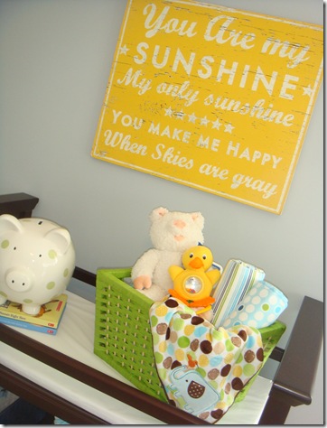
over the weekend billy and i headed over to historic grant park to the 8th annual summer shade festival.  it was a gorgeous day and we were loving the slightly cooler weather.  the highlight of my day was getting to see the booth belonging to the local art company “go jump in the lake.” 

imagei’ve used their rustic signs in the past and have always loved them.  most recently i used one of their “lake” signs in a model home’s nursery.

DSC06592DSC06584 DSC06585

{images – charm home}

all of their signs are hand crafted and made to look like they’ve been exposed to the elements for years. 

lake 1

their signs with quotes on them are my fave.


lake 2

lake 3

i loved the wall of local atlanta neighborhood signs too.  it really reminded me how many great historic neighborhoods atlanta has.

lake 4

if you get a chance check out their website or purchase a sign from their etsy shop.

Sunday, August 29, 2010

dining table envy

over the weekend i picked up one of my old house beautifuls.

image

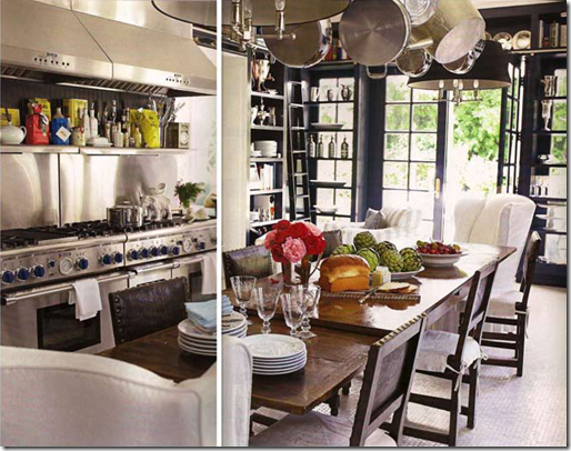
i had forgotten how much i loved windsor smith’s home that was featured in september ‘09, especially the extra large dining table in the kitchen. 

image

i love how it functions as a dining table and as an island.  i wish my dining area was just a smidge bigger.  i love large, farmhouse-style dining tables, but my dining area is not large enough to hold one.  totally envious of windsor’s dining space though.

~~~~~~~~~~~~~~~~~~~~~~~~~~~~~~~~~~~~~~~~~~~~~~~~~~~~~~~~~~~~~~~~~~~~~~~~~i’ve been working little by little on my condo all this year.  i haven’t gotten much completed due to a lack of time, but it’s slowly coming together.  i’m looking forward to picking out something to add to my place from csn stores.  i’ll be reviewing a product soon for them and i’m really excited to pick out something fun.

**all images – house beautiful

Friday, August 27, 2010

Change Up Bag Lunches with Tortilla Roll-ups


My Mom always did a great job packing our lunches while we were in school.  And yes, I was one of those kids whose Mom packed their lunch up until their very last day of high school - thanks Mom!

As most kids do, I went through phases of liking certain things more than others.  Only wanting turkey sandwiches with nothing but turkey and bread (how boring!) and loving peanut butter and jelly (minus the jelly).  But I always got excited when my Mom would change it up a bit with something new and Tortilla Roll-ups were definitely a pleasant surprise.

Now while I don't have school aged children yet, we had a playdate this week with a good friend and her little ones, so I decided to whip up some of these roll-ups for the occasion.


This is my grown up version of Tortilla Roll-ups (with lots of yummy things inside), but my girls love them, so your kiddos probably will too!

Tortilla Roll-ups
Serves 3 (big kids) - 6 (little kids)
Ingredients:
1 block cream cheese
1 can diced green chiles
1 small can sliced black olives
1 tablespoon fresh chives (or one green onion, sliced)
6 slices of ham
6 flour tortillas


Directions:
Set cream cheese out on kitchen counter for 30 mins. or so to allow it to soften.  Meanwhile, drain black olives and give them a rough chop.  Slice green onions or chop chives (both are tasty so use what you like best).  Place green onions (or chives), roughly chopped black olives, and canned green chiles into a large mixing bowl.  Stir to combine.

Add your cream cheese to the green onion, olive and green chile mixture.  Work the cream cheese into the mixture with a wooden spoon.  Mix until the cream cheese is completely combined.

Now for the roll-ups.  Using a spatula, spread 1/6th of the mixture evenly on top of a flour tortilla and place a piece of ham on top.  Roll up your tortilla.


Pack two tortilla roll-ups (or one for an elementary age student) for lunch by wrapping them in plastic wrap.


If your little ones (or bigger teen ones) prefer little finger foods, slice tortillas and pack in a small tupperware container. 


The sliced version make a wonderful appetizer or a finger food dish to bring to a party.


And hey, grown-ups love these things to, so even if you don't have kids, make some of these for yourself for lunch - you will love them - deeeelish!

Cottage Mama's Note:  If your children prefer are more simplistic recipe, just make these with plain cream cheese and ham.  It will still be something different than their regular sandwich.

{ Master Bedroom ~ Sneak Peak }

Sorry for all the "sneak peaks".
That seems to be all I have around here.
There's nowhere in this house that is complete.  Too much A. D. D. & 
not enough m. o. n. e. y. !
So, for now I'll offer little snippets of rooms.
The master bedroom is turning out pretty well. I like the layout, and the all the pieces I've put together in there.
Hopefully one snowy day this winter I'll paint the walls.
I hope to do some kind of wall treatment with wood and moldings & oatmeal painted walls .
But for now the green will do.  It's the only room in the house that was painted a color when we moved in in July.  I don't dislike the color, just want some more warm whites in the room. 
Enjoy!


I found this table above at a local thrift store I just discovered. ($20)
If you live anywhere near IMPACT thrift store in Montgomeryville, PA I suggest you get your butt over there.
It's AWESOME!  (But, leave some good stuff there for me)


some yummy white cotton ruffle sheets


chippy old frames, probably found in the trash years ago


some mis-treatments re-used 
from our other house


an old piece of wood I found in a friend's barn up the mountains.  It was already like this, I just hung it and laid some pictures on it.


more chippy


really exciting, I know...
some linen colored storage boxes from IKEA
to get the closet in shape.

More to come after I paint the walls, 
pray for snow, would 'ya?

giveaway update

last month i did a little giveaway from csn and jan from the life of a future domestic goddess won.  i thought i would share her entry/stairway project with you all because she used the credit that she won from csn to complete it. 

here is what her entry looked like before

beforeduring…

duringand the awesome after…

aftershe painted her stairs black and added a rug and light fixture from csn.  if you want to hear more about her entry/stairway update you can visit her blog here.

thanks for sharing your makeover

with us jan. it looks great!

Wednesday, August 25, 2010

{ chandelier }

some simple changes to the brass chandi 
turned it into this...


here's the before...


I used plain white shades from Lowes and edged them in clothes line rope.


I had super-babysitter, Ashley, hold a large moving box up in the air so the 
chandi was encased in it.
This made it possible for me to spray paint the chandi while it was still hung.


I still have some tweaking to do ~
  • paint the round thing at the top
  • make a cord cover
  • cover the walls in the room with some kind of wood treatment ~ I hope to make it look like it was once an outdoor room that's been converted.
{check out Funky Junk for some more great chandi ideas}

Monday, August 23, 2010

Sew Basics: Applique


Applique is a great way to add detail to your favorite sewing project.  I define applique as a piece of fabric sewn on top of another piece of fabric (though some might consider embroidered patches as applique as well).  You can add applique to quilts, shirts, blankets, onesies, bibs, burp clothes and the list goes on and on.  Applique is very simple and is a great project for the beginning sewer.   

Here are the supplies needed for basic applique:

Double-Sided Fusible Interfacing
(such as Wonder-Under or Steam-A-Seam Lite - these are the two I use)
Scissors
Pencil (if drawing your applique)
Sewing Machine
Thread
Iron
Ironing Board

To demonstrate the applique technique, I will walk you through a couple items I made recently for my etsy shop, The Cottage Mama - an appliqued "tie" shirt and a basic square applique "Little Red Riding Hood" onesie.


First you need to cut out your pattern.  You can be as detailed or as basic as you like.  For basic applique, as seen above, cut your pattern out of fabric AND cut the same pattern out of your fusible interfacing.  If your design is very detailed, I might recommend fusing your interfacing onto a larger piece of fabric first and then cutting out your pattern (it will just make your life easier that way).


Double-sided fusible interfacing will have a paper backing on both sides.  For the next step you need to remove ONE side of the paper backing.


Next place your fabric (right-side up) on top of the side of interfacing WITHOUT the paper backing.  This is the side that you just removed the paper backing from in the previous step.  Use a hot iron and iron the fabric to the interfacing. 


Now your interfacing is fused to your fabric applique pieces.  One side is fabric and the other side will feel like paper (because it still has the paper backing on).


Remove the paper backing from the wrong-side of the fabric.  You will notice that there is a thin layer of interfacing that is now fused to the fabric.


Place your applique piece where you would like it to be position, in this case, on the front and center of a onesie.


For the tie, there are two pieces, so place the first piece in position and then the second.


At this point you can play around with your applique pieces and move them around until you get them positioned just right.


Once you have them positioned, use your hot iron to fuse the applique to your other piece of fabric (again, in this case a onesie and a t-shirt).  After ironing, your applique will pretty much be secured in place.


I prefer to take it a step further and stitch around the applique piece.  For the tie, I did a very tight zig-zag stitch (almost resembling a satin stitch).  To do this, set your machine on a regular zig-zag stitch and reduce the stitch-length almost as low as it will go (I set mine on .3).  It's always good to do a test run before actually stitching on your applique (trust me, I learned this the hard way).


If you have trouble getting your machine to feed the fabric on such a low stitch-length, try setting it a little higher and try again.  Like I said, always test it out to see if the stitch meets your expectations.


I like to set my stitch-width to 3.0 or 2.5 for this type of applique, but again, that is all personal preference.  Make sure to stitch along the very edge of the applique piece.  This will ensure a clean line and no fraying after washing.


For the Little Red Riding Hood Onesie I used a longer stitch-length as I wanted to be able to see the zig-zags.  I also used a little bit narrower stitch-width as well.


After stitching around the applique, I added additional detail by doing some hand embroidery on the trees as well as around the border of the applique.  I think this attention to detail makes this onesie truly special!


I just love the simplicity of this appliqued onesie.  I used a Japanese import (linen/cotton blend) fabric for the main applique.  The onesie is made from organic cotton and recycled polyester and is amazingly soft.

Here are a few other examples of some past applique techniques:


I don't know if you remember my Dress Shirt Sleep Sack Tutorial, but here I used a basic flower applique.


I used fusible interfacing and applied it to a large floral fabric (Church Flowers from "Nicey Jane" by Heather Bailey).  After applying the interfacing I cut more detail around the flower.  I found it much easier to cut once I already had the interfacing applied.


Then I ironed my applique piece onto the sleep sack.  To stitch this applique, I simply used a straight-stitch around the border.


For my Sleepover Pillowcase Tutorial, I applied fusible interfacing to a large square of fabric.  I then hand-drew these letters for the monogram and cut them out.  Then I removed the final paper-backing, ironed them on the edge of the pillowcase, and used a zig-zag stitch to finish the applique.


Here is a onesie from my etsy shop.  On this "tie" onesie I used a straight-stitch to finish the applique.  In this case, I thought a slightly frayed edge would be really hip and cute for a little boy.  If you do not like the frayed look, then I would not recommend using a straight-stitch.  I apply Fray-Check to the edge of all of my straight-stitch appliques.  I think this helps make the edge fray slightly, but not look sloppy.


And finally, this is Savannah's "S" pillow that I made for her big girl room.  I used a heavier interfacing for the "S" because I wanted it to stand out a bit more.  The fabric used here is Heather Bailey's "Freshcut".  For most applique work, I use Wonder-Under or Steam-a-seam Lite, but there are some instances that I just like an interfacing with a little more body.

Cottage Mama's Note:  If you have any questions in regards to my "Sew Basics" series, please don't hesitate to email (thecottagemama@gmail.com) or comment and I'm happy to help.
Related Posts Plugin for WordPress, Blogger...